hi!
say HI! to the dopest feel-good medical cannabis.
client: imc, corp.
the coolest sister brands of hi-quality and hi-value cannabis products born and bred in Puerto Rico.
LogoS
The sister brands' logos feature a bold and straightforward design that highlights the brand name. This chunky, simple design makes it easy to switch between the brand's vibrant colors, helping to distinguish between products. As shown below, the logos are nearly identical, with the key difference being that one includes the word "Cannabis." The goal is to create a cohesive and easily recognizable brand identity for both, where the distinction is subtle yet effective.
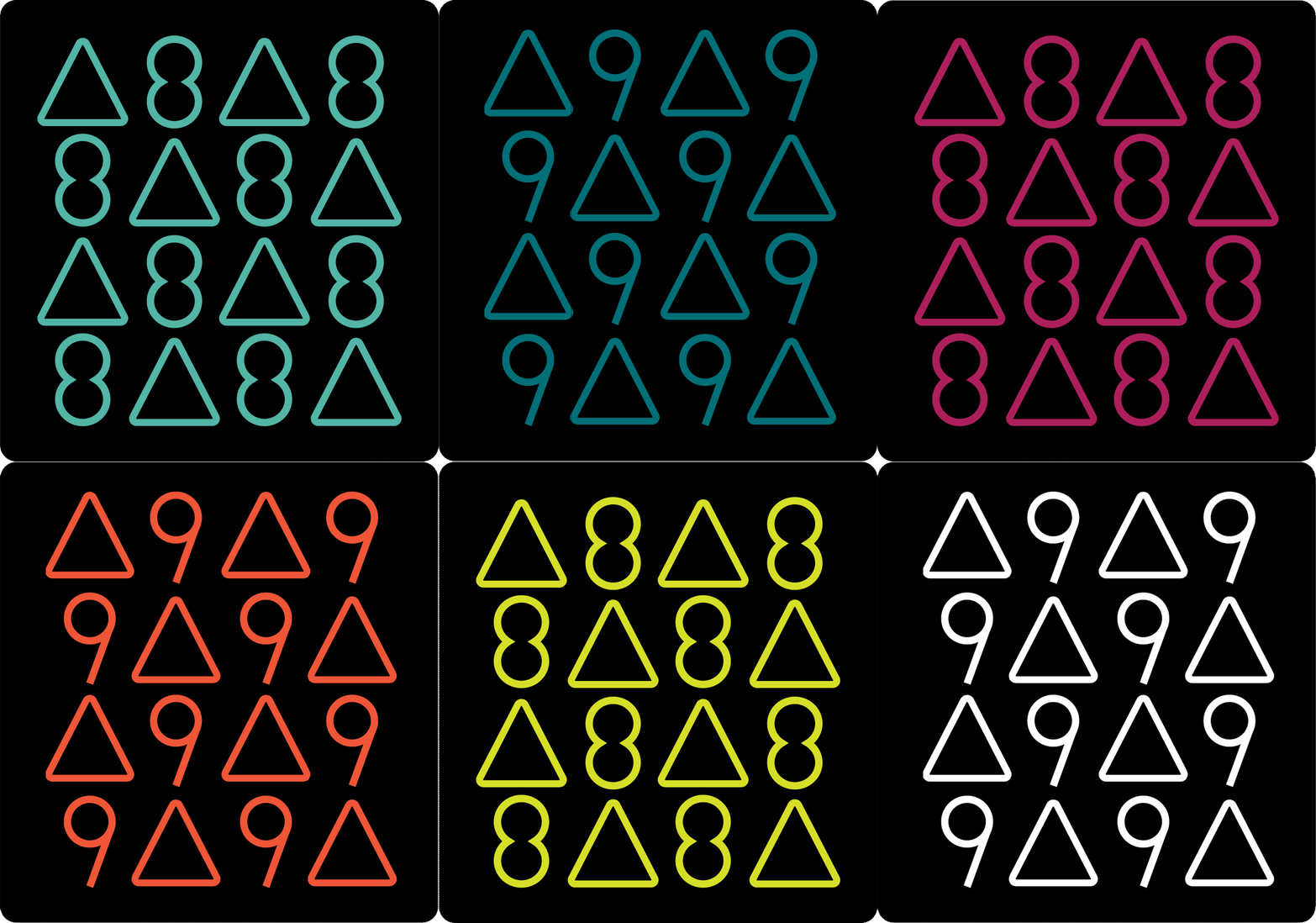
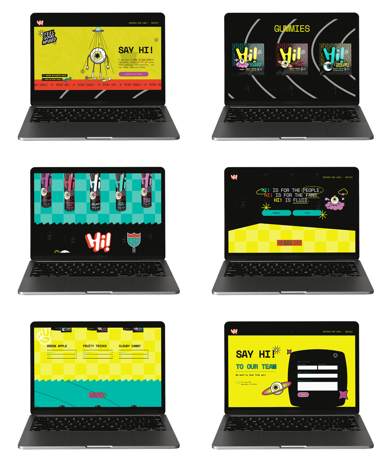
The products under the Hi! brand are formulated with CBD, Delta-8 cannabinoids, and Delta-9 cannabinoids, and are available for purchase in medical dispensaries as well as other retail stores.
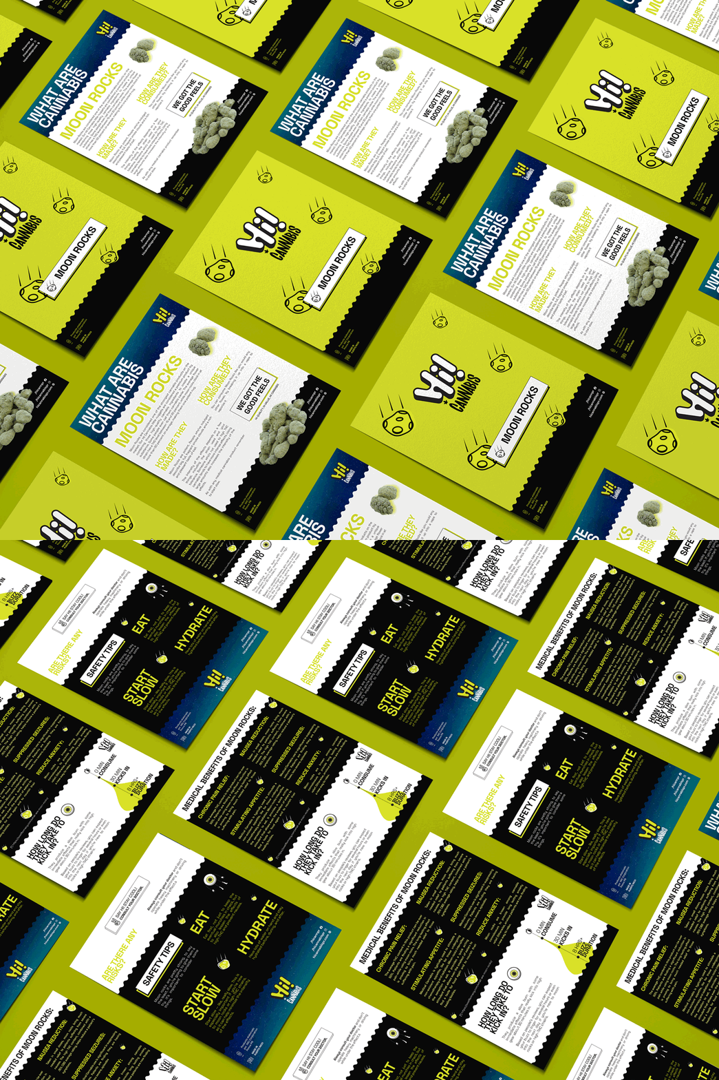
the products under the hi! cannabis brand are formulated with thc and are only sold in medical dispensaries.
Mascot
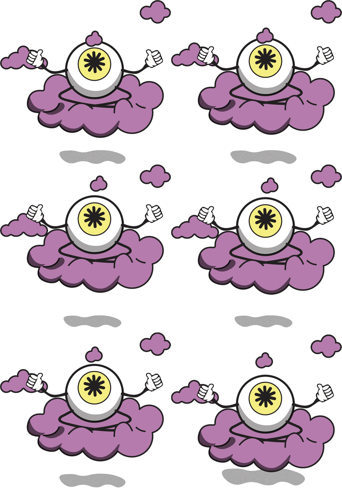
The mascot designed for this brand is truly eye-catching. The standalone eye is instantly recognizable, and when personified with limbs, it gains a versatile quality that allows it to represent various activities. This mascot helps consumers quickly identify and connect with the brand at a glance, while also opening up new branding opportunities, such as incorporating it into merchandise.


